Uber has a new logo. A lot of people have been writing about this, and while I have yet to look into it, for myself, I’m just going to say it how I see it. I don’t like it. I don’t get it. It doesn’t make sense.
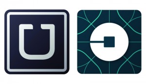

They’re old logo is on the left, and their new logo is on the right. What’s up with the veins on it? Are those supposed to represent roads on a map? Is that circle around the destination, represented by a square with a road going toward it? Therein lies the problem with this new logo. It looks like it could be anything and doesn’t say “Uber” to me.
What are your thoughts?