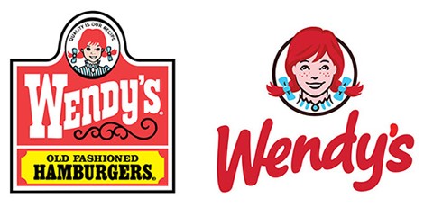
This one happened a few years ago, but I wanted to bring it up, because it’s a classic example of an old brand doing a modern refresh that works.
Wendy’s.
The new logo is younger and more fun, with a nice, handwritten style to the font. They’ve also aged Wendy herself up. It seems like, rather than being a small girl, she’s now in her teens. They’ve also lost the western grill look, with the 1800’s style to it.
But to me, this is a win. It also goes along well with all of the rebuilds that I’ve been seeing happen locally. The modern Wendy’s restaurants feel much more modern. And they always have better food than McDonald’s and Burger King.
