Skip to content

DesignTrek

Design, Video Editing and Technology Blog

  • Movies
    • Movies I’ve Seen
  • Amazon Wishlist
Recommend on Google Follow @LuminousSpecter

Design Blogs

  • CSS-Tricks
  • Layers Magazine
  • Web Designer Wall

My Websites

  • GB World Hub
  • Legendarium Media
  • M. Night Fans
  • Matrix Fans
  • Mesozoic Mind
  • Narnia Fans
  • SweetPaul Entertainment
  • Walden Fans

RSS Ghostbusters World Hub

  • Is Janine coming to Ghostbusters: Spirits Unleashed?
  • Ghostbusters: Spirits Unleashed – 1.4.1 Patch Notes (Hotfix)
  • Win Two Game Keys for Ghostbusters: Spirits Unleashed with Illfonic’s 25-Winner Giveaway
  • We need a modular Ghostbusters Firehouse Playset
  • Ghostbusters: Spirits Unleashed – 1.4.0 Patch Notes (DLC #1)

RSS SweetPaul Entertainment

  • How Girl Meets World handled Autism
  • Comic Con Guide: What to expect when attending Comic Con for the first time
  • My Favorite Films of 2019
  • Who are you going to telephone? Ghostbusters 3 is coming!
  • Movies that Deserve Direct Sequels

Tags

  • 44.1 kHz
  • 48 kHz
  • 44100 Hz
  • 48000 Hz
  • adobe
  • after effects
  • Amazon
  • Audio
  • Conversion
  • cs3
  • cs4
  • CSS
  • Cutenews
  • dear adobe
  • design
  • dreamweaver
  • dynamic link
  • encore
  • fight scene
  • filmmaking
  • fireworks
  • help
  • illustrator
  • juarez
  • master collection
  • Menu
  • mexico
  • Microsoft
  • mission-trip
  • movies
  • New Logo
  • onlocation
  • photoshop
  • premiere
  • Premiere Pro
  • preview
  • production premium
  • promotional-video
  • sneak peek
  • Sync
  • version cue
  • video
  • wav
  • Windows 7
  • Wordpress

Tag: New Logo

Wendy’s – New Logo

This one happened a few years ago, but I wanted to bring it up, because it’s a classic example of an old brand doing a modern refresh that works.

Wendy’s.

Wendy's

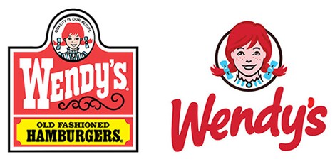
The new logo is younger and more fun, with a nice, handwritten style to the font. They’ve also aged Wendy herself up. It seems like, rather than being a small girl, she’s now in her teens. They’ve also lost the western grill look, with the 1800’s style to it.

But to me, this is a win. It also goes along well with all of the rebuilds that I’ve been seeing happen locally. The modern Wendy’s restaurants feel much more modern. And they always have better food than McDonald’s and Burger King.

Posted on February 26, 2016February 26, 2016Categories New LogosTags New Logo, Wendy'sLeave a comment on Wendy’s – New Logo

Uber – New Logo

Uber has a new logo. A lot of people have been writing about this, and while I have yet to look into it, for myself, I’m just going to say it how I see it. I don’t like it. I don’t get it. It doesn’t make sense.

Uber logos

They’re old logo is on the left, and their new logo is on the right. What’s up with the veins on it? Are those supposed to represent roads on a map? Is that circle around the destination, represented by a square with a road going toward it? Therein lies the problem with this new logo. It looks like it could be anything and doesn’t say “Uber” to me.

What are your thoughts?

Posted on February 26, 2016Categories New LogosTags New Logo, UberLeave a comment on Uber – New Logo

Red Robin – New Logo

Red Robin is a place my wife and I like to go with friends when we want to have burgers, shakes or chicken burgers.

20121017_042050_Red-Robin-Logo

Red Robin had different logos before this, but this was the most recent and without doing a ton of research, it’s definitely the one that I’m the most familiar with.  The bold colors and fonts are very restaurant, and very confident.

red-robin-reevaluating-its-brand

A few years ago, Red Robin decided to try and simplify their brand, and apparently did some tests with this as their logo in some areas. Not sure how much testing they did, because I might have seen it once on some coupons but it probably didn’t go so well. I’m not a big fan of the fire on top of it.red-robin-new-logo

Today I saw a commercial for Red Robin that ended with this. It appears they’ve settled on a new logo with a friendly, rounded font, and strong bold lettering underneath. It’s a look that I instantly liked. Much simpler, easier to read, and still maintains the colors they’ve always used, though simplifying those further to three basic colors.

I’d call this rebrand a win.

Posted on February 24, 2016February 24, 2016Categories New LogosTags New Logo, Red RobinLeave a comment on Red Robin – New Logo
Proudly powered by WordPress